Button & Button Row
Buttons are links that function as calls to action. They are most often used to indicate an important link, or are included in cards as the main checkpoint.
Adding buttons to cards is done within the Card Blocks in the WordPress editor.
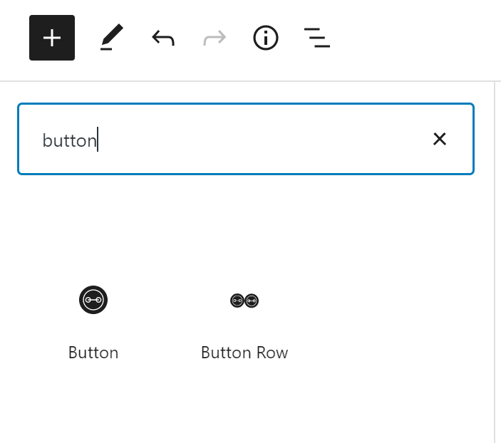
To add a button within the page content, click on the “+” and search for “Button”.
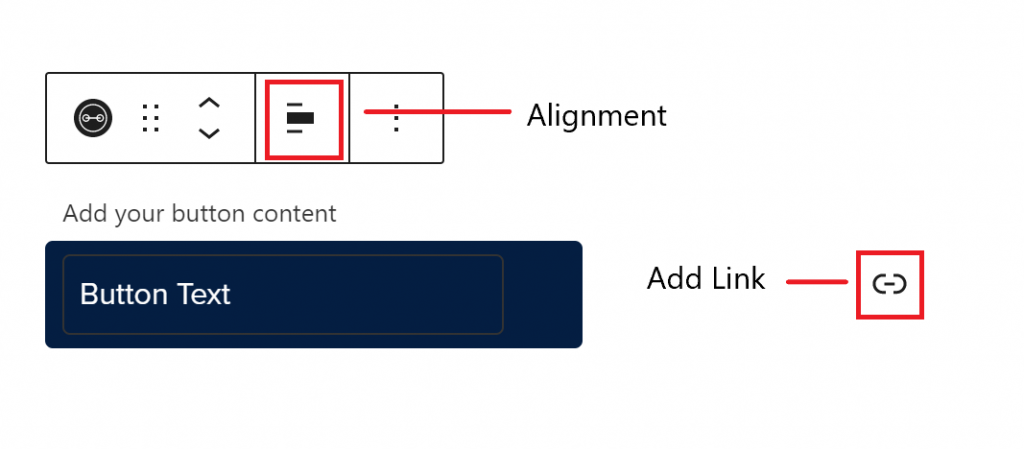
Selecting “Button” will add a button block to the editing interface. The block itself will have options to add link text, add a link, and change the alignment while the block settings in the inspector panel on the right has options to customize the button color, size, fill, icon, and aria-label.

Examples of Sizes
Examples of Alignments
Colors & Fills
Opening the Styles menu in the right inspector panel will show the different fill options.
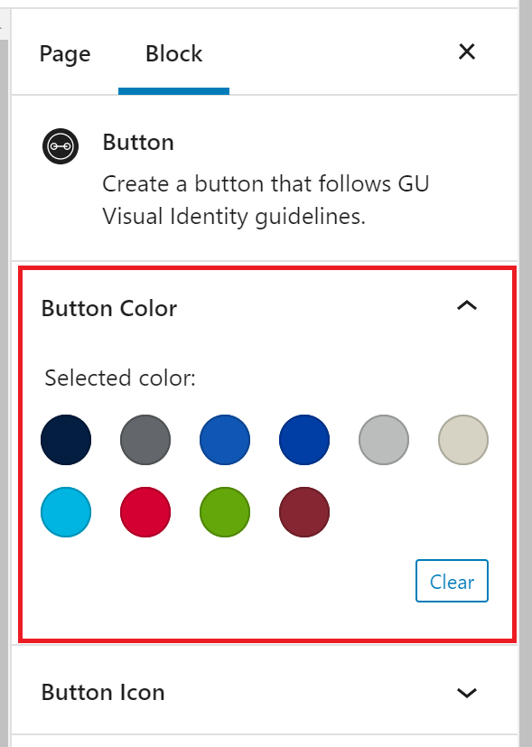
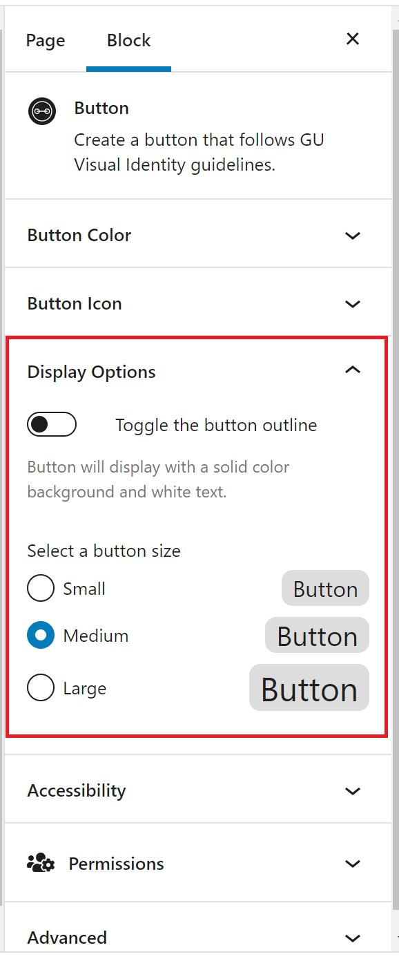
Selecting the Display Options menu in the block settings panel will allow you to toggle the “outline” vs “solid” styles of the button as well as select the size of the button you’d like.
Icons
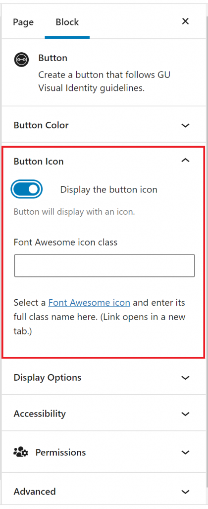
Icons can be added to buttons using the editor on the right side of the page. Open the “Font Awesome icon” link at the bottom of the page to browse through icon options. Once locating the desired icon, write the icon class in the designated field. The icon will appear to the left of the link text.
Button Accessibility
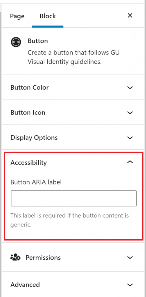
If your button content is generic, it is important to add an ARIA Label to let users know where the link is going. ARIA Labels can be added using the block settings panel on the right side of the page under “Accessibility”.
Button Row
Adding a button row block will create a horizontal line of buttons starting on the left of the page.
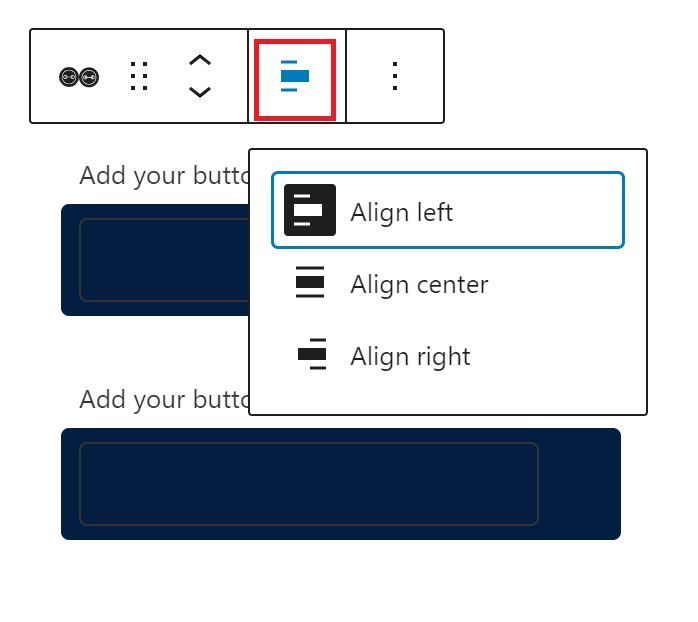
You can adjust the alignment of the block in the editor above the block.
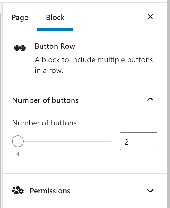
You can also adjust the number of buttons per row using the editor on the right side of the page.
