Best Practices
File Naming Conventions
Best practices for website management include naming uploaded files with relevant names. Sometimes, downloading a file will create a default file name consisting of a long string of numbers and characters. In order to avoid having these file names on a website, rename files before uploading them to WordPress.
It is best to stick to letters and numbers only. If the file name of your image has other characters they should be removed or replaced with the “-” symbol. Instead of using spaces, include dashes or underscores.
Examples of good file names:
- jack-the-bulldog.jpg
- healy-hall.jpg
- john-carroll-tulips.jpg
Examples of bad file names:
- jack the bulldog.jpg
- john carroll & tulips.jpg
Best Practices for Featured Images
Featured images display as a header image on WordPress web pages. In order to create a visually appealing and accessible web site, keep these tips in mind.
Avoid Collages
Good website design will avoid using collages for featured images. Collages are not only less visually appealing, but they also are difficult to describe in alternative text. One image will create a simple and clean look for the web page.
Never use Images with Text
Images with overlay text should never be used, but they should especially be avoided in Featured Images. Text within an image is impossible for visually impaired users to access with a screen reader. It is also difficult for users to read on small screens, like mobile phones. Good website design will avoid images with overlay text to create a user friendly and accessible website.
Teaser Text
On Landing Pages, the page title, landing page heading text and header link appear in the bottom left corner of the featured image on the web page.

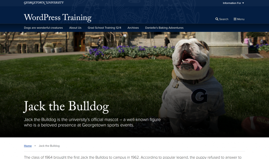
Because of this, it is important to select featured images that have open space in the bottom left. Make sure the focus of the image is not covered by the title, text or link. Jack the Bulldog is the focus of this image and he is far to the right, avoiding the space used by the link and text.
