Increasing Traffic and Readability
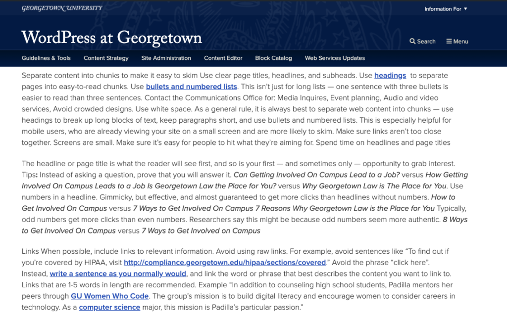
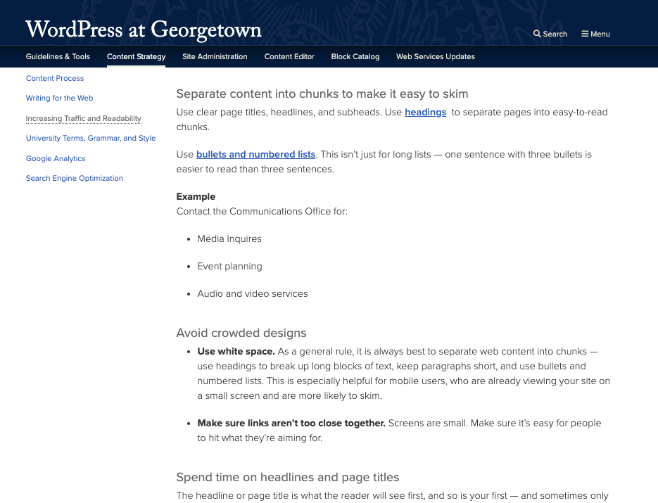
Separate content into chunks to make it easy to skim
Use clear page titles, headlines, and subheads. Use headings to separate pages into easy-to-read chunks.
Long paragraphs with few breaks:

Content broken up into digestible chunks:

Use bullets and numbered lists. This isn’t just for long lists — one sentence with three bullets is easier to read than three sentences.
Example
Contact the Communications Office for:
- Media Inquires
- Event planning
- Audio and video services
Avoid crowded designs
- Use white space. As a general rule, it is always best to separate web content into chunks — use headings to break up long blocks of text, keep paragraphs short, and use bullets and numbered lists. This is especially helpful for mobile users, who are already viewing your site on a small screen and are more likely to skim.
- Make sure links aren’t too close together. Screens are small. Make sure it’s easy for people to hit what they’re aiming for.
Spend time on headlines and page titles
The headline or page title is what the reader will see first, and so is your first — and sometimes only — opportunity to grab interest.
Tips:
Instead of asking a question, prove that you will answer it.
- Can Getting Involved On Campus Lead to a Job? versus How Getting Involved On Campus Leads to a Job
- Is Georgetown Law the Place for You? versus Why Georgetown Law is The Place for You
Use numbers in a headline. Gimmicky, but effective, and almost guaranteed to get more clicks than headlines without numbers.
- How to Get Involved On Campus versus 7 Ways to Get Involved On Campus
- 7 Reasons Why Georgetown Law is the Place for You
Typically, odd numbers get more clicks than even numbers. Researchers say this might be because odd numbers seem more authentic.
- 8 Ways to Get Involved On Campus versus 7 Ways to Get Involved on Campus
Links
When possible, include links to relevant information.
Avoid using raw links. For example, avoid sentences like “To find out if you’re covered by HIPAA, visit http://compliance.georgetown.edu/hipaa/sections/covered.”
Avoid the phrase “click here”. Instead, write a sentence as you normally would, and link the word or phrase that best describes the content you want to link to. Links that are 1-5 words in length are recommended.
Example
“In addition to counseling high school students, Padilla mentors her peers through GU Women Who Code. The group’s mission is to build digital literacy and encourage women to consider careers in technology. As a computer science major, this mission is Padilla’s particular passion.”
PDFs
Avoid PDFs whenever possible. PDFs are not searchable, are not mobile friendly, and lead the user away from your site.
Some exceptions are:
- If you are adding a form that you expect site visitors to physically print and fill out.
- If you would like to add a long document that will be of interest to only a small proportion of visitors.
If you feel that including a PDF is appropriate, it is best practice to put a short summary of the document on the webpage with a link to the entire PDF at the end. Creating a page that contains nothing but a link to the PDF looks unwelcoming to visitors and will not work well with a search engine, and therefore is highly discouraged.
Alternative (Alt) Text
Alt text is a text description of an image. Screen readers and voiceover assistive apps read the alt text to a user, and if images are turned off in the browser, the alt text displays in its place.
Because alt text doesn’t always appear, site editors sometimes neglect this feature. It is in you best interest, however, to include descriptive, accurate alt text with every image because:
- Many search engines use alt text to decipher images. In other words, including alt text is good for SEO.
- Visitors to your site, particularly those on mobile devices, won’t have to wait for larger images to load.
- Visitors with a slower connection can choose not to load images and instead just read the alt text.
Visitors do not travel in a straight line
Visitors can come in on any page on your site, particularly if they access your site from a search engine. Never assume they have seen the homepage first.
Use the “web” aspect of the internet to your advantage — weave in outside content. Do you have a Facebook page? Twitter feed? Add it to your homepage. If your department is in the GU calendar, consider adding a calendar feed to your homepage. It goes the other way: If you have a new announcement, event, or blog post on your site, share it on your social media channels.
Tip: If you find yourself breaching the Twitter’s character limit while sharing your stellar content, Google and Bitly offer free URL shorteners.
URLs
When creating a URL for a new page, use dashes between words instead of spaces. Links to the page will still work with these spaces, but Drupal will fill the spaces with “%20”. As a result, this link looks unprofessional in an email or brochure — not to mention difficult to read.
Example: http://nhs.georgetown.edu/about%20us versus http://nhs.georgetown.edu/about-us
For more URL tips, visit our Search Engine Optimization page.
